How Typography Shapes Your Brand Identity

May 8, 2026
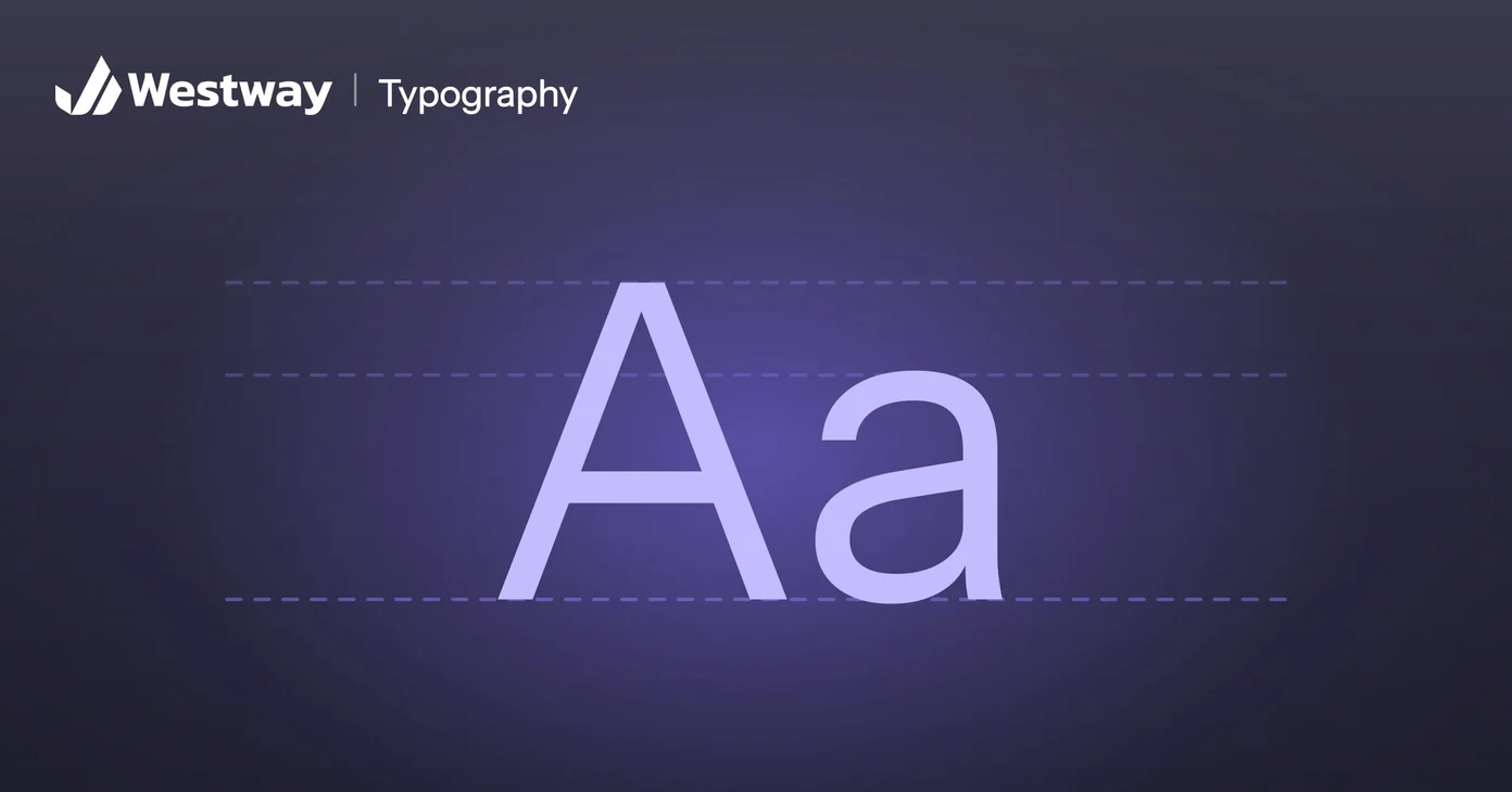
Typography shapes how customers feel about your business before they read a single word. The fonts you choose signal whether you are modern or traditional, playful or serious, premium or affordable. For something so quiet, type does a remarkable amount of work in building a brand identity. This guide explains how to choose type that fits and how to use it well.
How does typography shape a first impression?
It sets the tone before anyone reads a sentence: people judge a brand in a fraction of a second, and typography is a big part of that first impression. A sharp, modern typeface reads as confident and current; a classic serif reads as established and trustworthy. The wrong choice sends the wrong signal, no matter how good your actual work is. Strong type aligns the feeling with the reality.
Serif typefaces, the ones with small strokes at the ends of the letters, tend to feel traditional. Sans serifs feel clean and modern, while script and decorative faces feel personal but tire the eye over long passages. Neither family is better. A law firm and a skate shop can both get it right with opposite choices, as long as each one fits the business behind it.
Why does consistency build recognition?
Because repetition is how identity forms in a customer's mind. Using the same typefaces everywhere, on your website, in your emails, and in your documents, makes your brand instantly recognizable. Switching fonts between pages does the opposite, making a business feel disorganized and harder to trust.
Write your typography rules down: which typeface for headings and which for body text, the sizes and weights for each level, and what to use where the brand font isn't available. Email is the usual gap, since many email programs fall back to standard system fonts. Our guide to brand guidelines covers where those rules should live.
What makes typography readable?
Comfortable sizes, sensible line spacing, and enough contrast against the background. Beautiful type that is hard to read fails at its main job, so good typography balances character with clarity. For many businesses, most visitors are on phones (check your analytics), so readability on small screens often matters most of all.
In practice, keep body text no smaller than the browser's default size, and save decorative faces for headings, where a few large words stay legible. Then check your pages on an actual phone, outdoors if you can, as well as on a large monitor.
Why should a brand limit its fonts?
Because every font you add makes the brand look a little less like one business. The most common typography mistake is using too many fonts. Two typefaces, one for headings and one for body text, cover almost every need and keep things coherent. Quality, well-made fonts, like many on Google Fonts, are free and reliable, so there is no reason to settle for a cluttered mix.
One family with several weights can even do the work of two. If you do pair two typefaces, make the contrast obvious, such as a serif with a sans serif, because two similar ones look like a mistake. Our guide to font pairing shows combinations that work.
How do you choose typography for your brand?
Start from your brand's personality, then test candidates on real content:
- Describe the personality in a few words, such as "calm and expert", and judge each typeface against them.
- Test real content, like your headline, a paragraph of copy, and a price list, at actual sizes on a phone and a laptop.
- Check the practical details: enough weights, clear numbers, and support for every language and special character you use.
- Look at your competitors so you don't blend in.
- Read the license for every place you'll use the font, including your website, print, and ads.
What do brand fonts cost?
Often nothing at all, although commercial fonts carry license fees. Free fonts, such as those on Google Fonts, cover most small-business needs. Commercial typefaces from type foundries are licensed, often separately for desktop, web, and app use, and web licenses are sometimes priced by traffic. A custom typeface is a major investment that usually only large brands need. Check the terms before you build a brand around a font: one licensed for print but not the web becomes a problem the day you redesign your site.
Frequently asked questions
How many fonts should a brand use?
Usually two: one for headings, one for body text. More tends to look messy.
Does typography really affect sales?
Indirectly, yes. It shapes trust and clarity, which influence whether people buy. Prices or forms that are hard to read can cost you sales more directly.
Can I use free fonts?
Yes. Many high-quality free fonts are suitable for professional brand use. Download them from the original source, such as Google Fonts, rather than a free-font download site, so the license is clear.
What is the most common mistake?
Too many fonts, or choosing style over readability. Clarity should win.
Make your brand look the part
Typography is one of the simplest ways to make a business look polished and consistent. Put your website next to your latest proposal or invoice; if the type doesn't match, that's your first fix. Our design team helps businesses choose and apply type that fits their brand identity and reads beautifully everywhere.