White Space in Web Design: Why Less Is More

June 11, 2026
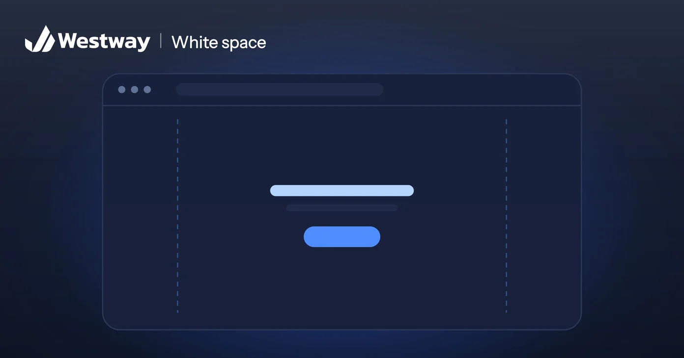
White space is the empty area between and around the elements on a page: the gaps between paragraphs, the margins around a button, the room surrounding your logo. It is not wasted space, even though the name makes it sound like nothing. Used well, white space is one of the most powerful tools in web design, guiding attention, improving readability, and making a site feel calm and professional. This guide explains why less really is more.
Does white space have to be white?
Despite the name, white space does not have to be white. It is simply the unmarked area of a design, whatever color the background is. Designers split it into two kinds: the large gaps between major sections, and the small gaps between letters, lines, and individual elements. Both matter. A page with generous spacing feels open and easy; a page crammed edge to edge feels stressful and cheap, no matter how good the individual parts are.
What is the main benefit of white space?
The clearest benefit is readability. Text with comfortable spacing between lines and around paragraphs is far easier to read than text packed tightly together. Studies of reading show that adequate spacing reduces effort and improves comprehension. When you give your words room, visitors absorb more of them. Cramming more text onto the screen feels efficient, but it usually means people read less, not more.
How does white space direct attention?
White space directs attention through contrast: an element surrounded by empty space stands out, because nothing competes with it. That is why a well-designed call-to-action button has plenty of room around it, and why a cluttered page with everything fighting for attention ends up with nothing standing out. Usability researchers at the Nielsen Norman Group have documented how white space guides the eye and signals what matters. Strategic emptiness is one of the strongest ways to direct focus.
How does spacing shape the way a brand feels?
Generous spacing reads as premium, confident, and modern, which is why luxury brands use it heavily. Dense, cluttered layouts read as cheap or chaotic. The amount of room you leave around your content sends a message about your business before anyone reads a word. For most businesses, more breathing room makes the site feel more trustworthy and considered.
How do you create more breathing room on a page?
You create breathing room mostly by removing what does not need to be there. Cut elements that serve no clear purpose. Increase the space between lines of text and around your headings. Give your most important elements room to breathe. Resist the urge to fill every gap, since those gaps are doing real work. The goal is a page where each element has space to be seen.
What is the difference between macro and micro white space?
The difference is scale. Macro white space is the large gaps between major blocks: the margins around the layout, the space separating sections. It sets the overall sense of openness and pace. Micro white space is the smaller spacing between lines of text, around buttons, and between list items. It governs readability and how polished the details feel.
Both matter, and neglecting either undermines the design. A site with generous macro spacing but cramped text still feels hard to read, while tidy paragraphs crammed into a dense layout still feel claustrophobic. Good design balances the two, giving sections room to breathe and giving words room on the line. When you review a page, check both scales separately, since problems often hide at one level while the other looks fine.
What is the quickest way to improve a cramped page?
You do not need a full redesign: take any cramped page and try three changes. Increase the line spacing on your body text so the lines are not packed together. Add more room above and below your headings, so each section reads as its own block. And remove one or two elements that are not pulling their weight, giving what remains more space. These small edits alone often transform how a page feels, and they cost nothing but a little time.
The trick is to be willing to take things away. Most cluttered pages got that way by adding, never subtracting, so creating space usually means deleting before adding. Step back after each change and ask whether the page feels calmer and clearer. If it does, you are on the right track.
Frequently asked questions
Is white space the same as empty space?
Yes, in effect. It is the unused area around and between elements, whatever the background color.
Does it waste valuable screen room?
No. It improves readability and focus, so visitors engage more, not less, with what is there.
Can a page have too much?
It can feel disconnected if elements drift too far apart. The aim is balance: related items grouped, clear gaps between sections.
Does it help on mobile?
Very much. Comfortable spacing and tappable gaps make small screens far easier to use.
Design with room to breathe
White space is the quiet ingredient that makes a site feel clear, calm, and professional. Our design team builds sites that use space deliberately to guide visitors and reflect the quality of your brand.