How to Design a Pricing Page That Converts

August 20, 2026
A pricing page is the last stop before a purchase decision. If you sell software or another digital product, a billing platform such as Paddle can handle the payments, tax and billing that follow, but the page itself still has to make the sale. If a visitor trusts your product and wants to buy, the pricing page determines whether they actually do. A poor page design causes visitors to leave, even when your product is worth the price. A well-designed pricing page makes the purchase decision easy and builds confidence. Understanding what works on pricing pages helps you design one that converts interested visitors into paying customers. This guide covers the principles of effective pricing page design.
What should a pricing page communicate?
A pricing page must be crystal clear: visitors should understand in seconds what each plan includes, what it costs, and what the differences are. It should address the questions in a buyer’s mind: is this plan for me? Do I get what I need? Is it worth the cost? It should remove uncertainty that prevents purchase. It should make the next step obvious: a button to start, a trial, or a form. A pricing page that is confusing, vague, or unclear will not convert, no matter how competitive the pricing.
How should you compare pricing tiers?
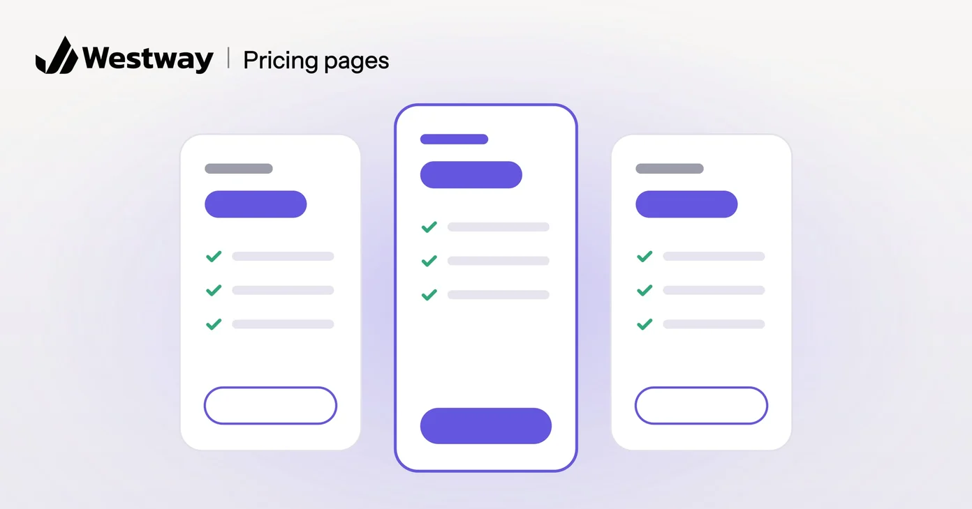
Use a comparison table so buyers can see at a glance what each plan offers. Most pricing pages show multiple plans, often called starter, professional, and enterprise, and each plan should clearly state what is included. Highlight the recommended plan, usually the middle tier, by making it slightly larger or using a different color. This guides buyers toward the option most likely to convert. Avoid hiding features or differentiating in ways that confuse; the goal is clarity, not tricks.
How do you show value on a pricing page?
Connect each feature to the benefit it brings. A pricing page lists features; the persuasive part shows the value. Rather than just saying “unlimited users,” say “Unlimited users so you do not have to manage licenses.” Show use cases, such as “for teams of five or more” or “for agencies managing multiple clients.” Help buyers see themselves using the product and understand why the price is worth it. This moves the conversation from “is this expensive?” to “is this valuable?”
How do you handle buyer objections on a pricing page?
Answer buyers’ doubts directly on the page. If your pricing is high, explain why: the value, the results, the support. Offer a money-back guarantee if you are confident in your product. Show customer testimonials or case studies that prove the value. Explain how long it takes to recoup the cost in business value. Remove the top obstacles to purchase by addressing them directly.
Why does mobile matter for pricing page design?
Many buyers will compare your plans on a phone, and your analytics will show how many. A pricing page must work beautifully on mobile. Stacked plans, not side-by-side comparison tables, work better on small screens. Buttons must be large and obvious. Typography must be clear and readable. Test on actual phones; how it looks in a desktop preview is not how it will perform.
Frequently asked questions
Should I show pricing or ask for a quote?
Showing pricing is usually better for conversion. People want to know the cost. Requiring a quote eliminates most browsers.
How many pricing tiers should I offer?
Three is the sweet spot for most businesses. Two leaves out middle options; more than four overwhelms.
Should my most expensive plan be unlimited?
Often yes. An “enterprise” or “unlimited” option captures customers with high needs who might otherwise go elsewhere.
How often should I change my pricing?
Rarely, but adjust annually or when costs change. Changing prices frequently confuses customers and hurts trust.
Design a pricing page that sells
A well-designed pricing page removes obstacles and builds confidence. Our design team designs pricing pages that are clear, compelling, and convert visitors into customers.