Above the Fold: What Belongs at the Top of Your Page

July 11, 2026
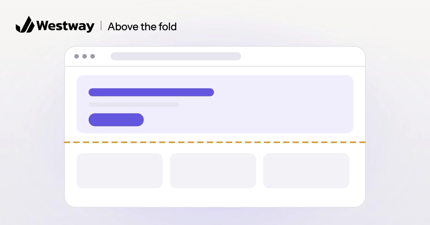
Above the fold is the portion of your web page visible without scrolling, from the moment someone lands on your site. The name comes from newspapers, where the top half of the front page sat literally above the paper’s fold. Online, it is the first few hundred pixels, and it is the most important real estate on your entire site. What you place there shapes whether a visitor stays or leaves, because if they do not see a reason to continue in the first second, most will bounce. This guide covers what to prioritize and how to use that precious space.
Does above the fold still matter?
Yes. Despite predictions that the concept would die, it remains crucial in modern web design. Mobile devices have made it even more important, since screens are smaller and scrolling is the main interaction. The average visitor spends less than a second forming a first impression, and that impression happens on the first screen, before they have read anything or scrolled anywhere. You cannot control whether someone scrolls, but you can control whether something up top is compelling enough to make them want to. A blank or confusing top half sends visitors to competitors in seconds, while a clear, relevant one keeps them engaged.
What should go above the fold?
Your most important elements belong above the fold. A clear headline that explains what you do or what the page offers is non-negotiable. A supporting visual, such as a hero image or a video, that reinforces the message comes next. A brief explanation of the value the visitor gains by staying should follow. A call-to-action button, such as “learn more,” “start a trial,” or “schedule a demo,” should sit prominently. For a homepage, your core message and a clear path forward are essential. For an inner page, context about what the page covers and why it matters to the reader helps engagement. The goal is simple: make the value and the next step obvious within the first few pixels. Research from the Nielsen Norman Group confirms that visitors form judgments in this space and will bounce without it.
What should you avoid above the fold?
Avoid anything that competes with your message or delays it, because these things actively harm first impressions. Large, unexpected pop-ups that interrupt the message send visitors straight to the back button. Autoplay video with sound, which startles and frustrates. Dense text or complex layouts that force the eye to work too hard. Ads or third-party content that distracts from your core message. A cluttered design that makes it hard to spot the most important element. Slow load times that leave the screen blank too long. Outdated design or obvious signs of neglect, which trigger distrust before the visitor has read anything. Keep this space clean, clear, and focused on the one thing the visitor needs to know.
How is above the fold different on mobile?
On mobile, the visible area is roughly the height of the phone screen, which is much smaller than on desktop. This means you have even less space and must be even more ruthless about priorities. A headline plus one compelling image and one button is often enough. Dense text, sidebars, and navigation clutter should either be simplified or moved below the fold. Mobile users are in a different mindset than desktop users, often browsing quickly or in between other tasks, which means your message needs to land even faster. Testing the top of your page on actual phones is non-negotiable; how it looks on a desktop preview is misleading.
Frequently asked questions
What size is above the fold exactly?
It varies by device and window size, so there is no single pixel height to design for. Check your analytics for the screen sizes your visitors use most, and test the page at those sizes.
Do people actually scroll?
Yes, but only if the first screen gives them a reason to. Research shows the majority do scroll, but a critical mass makes the decision based on what they see first.
Should above the fold include a menu?
Yes, keep navigation visible, but put it in a clean header that does not distract from your main message. A mobile menu can collapse into a hamburger icon.
Can I fit everything important above the fold?
Not usually. Pick the single most important thing and put that above the fold. Everything else goes below, in a logical flow.
Design the fold that keeps visitors engaged
Above the fold is your one chance to stop the bounce and start the scroll. Our design team builds pages where the first impression is compelling and clear, with enough at the top to hook attention.